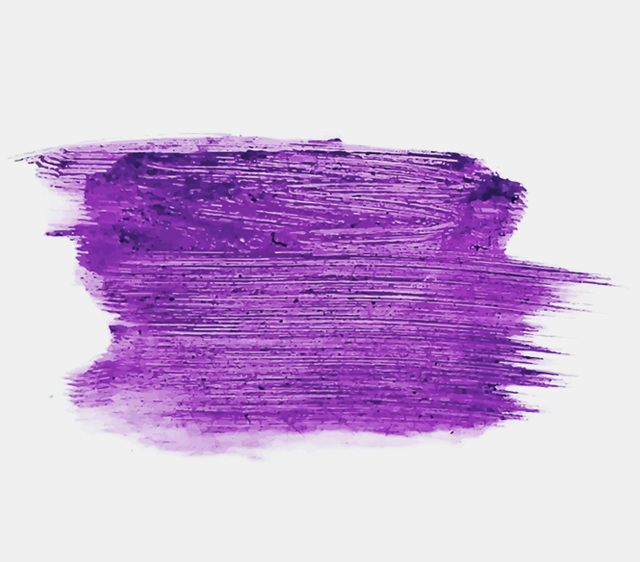
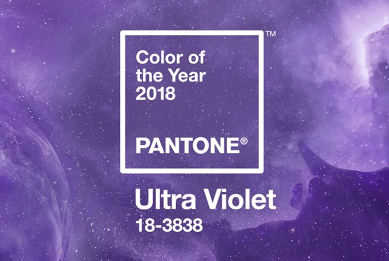
The Pantone Color Institute recently announced its color of the year 2018. Leatrice Eiseman, Executive Director of the Pantone Color Institute, introduced PANTONE 18-3838 Ultra Violet, a blue-based purple, which communicates originality, ingenuity, and visionary thinking. She says that, “We are living in a time that requires inventiveness and imagination.”
PANTONE 18-3838 Ultra Violet symbolizes experimentation and non-conformity, spurring individuals to imagine their unique mark on the world, and push boundaries through creative outlets, like Prince, David Bowie, and Jimi Hendrix, who used shades of Ultra Violet as personal expressions of individuality.
 Pantone Color Institute
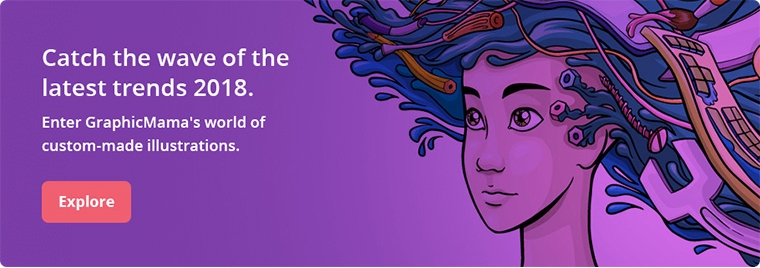 GraphicMama
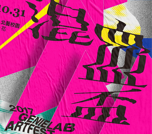
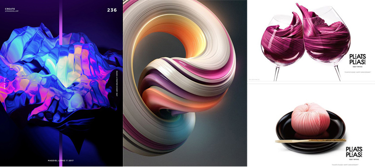
Bold and Bright Colors Are In
Bold and bright colors will be some of the biggest trends ushering in 2018, like Pantone’s 18-3838 Ultra Violet, Benjamin Moore’s Caliente AF-290, and Adidas’s Frozen Yellow. And when these bold colors are used in tandem with design techniques like 3D composition, glitch effects, typography, double exposure, among others, expect designs and projects to amaze and pop.
 GraphicMama
Color Gradients Are In; Solid Colors and Flat Materials Are Out
Flat and material solid colors have been massively popular. But no longer. More and more designers have begun using bolder and brighter colors, and incorporating other design techniques to create a visual that is arresting and amazing.
Color gradients were the kids left hanging around in the wings while solid flat colors took center stage. Not anymore. We may continue seeing solid colors in web and app designs that prioritize functionality and interface over design, but color gradients will begin rising, reaching its zenith in the coming year and just keep going strong.
![]() GraphicMama
GraphicMama
When Instagram redesigned its logo using color gradient last year, trend watchers and industry experts were divided over the update, arguing for or against it. What’s undeniable, though, is that the redesign sparked a design trend that is gaining momentum. In 2018 expect color transitions to become more popular even more popular, particularly for infographics, business and commercial designs and collaterals. .
![]() Popular Science
Popular Science
 Printsome Insights